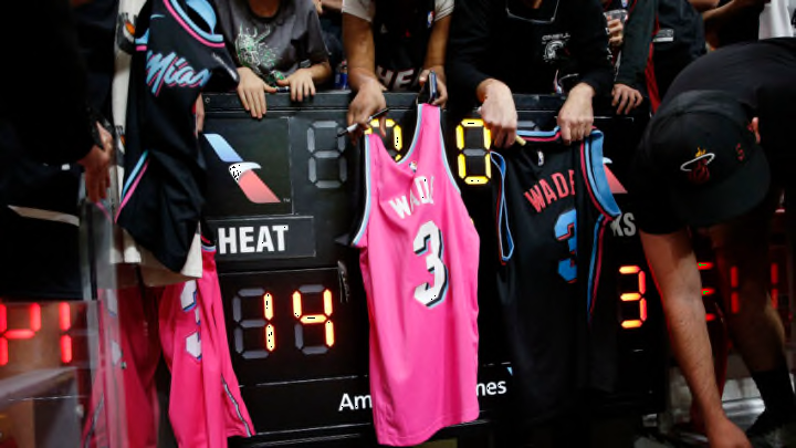
For many years, the Miami Heat have come out strong with their jersey designs, sporting some of the best, if not the best looks in the NBA. Over the years, the Heat have had many popular jerseys that were definitely worth the buy.
My personal favorites were the “White Hot” jerseys during the Big Three Era and any of the variations of the “Miami Vice” jerseys.
The NBA revealed the new City Edition jerseys. To celebrate the 75th anniversary of the NBA, each team designed their jerseys based on the “Mashup” theme that tied together their franchise’s history.
The Miami Heat’s jersey is shown below. I am usually a fan of the Heat jerseys.
https://twitter.com/MiamiHEAT/status/1455505061841342464
They always look so nice every year. But I am not loving this one.
The Miami Heat tend to knock it out of the part when it comes to their uniforms and the look. However, they may have whiffed on this one.
For a team that comes out with the best looking jerseys every year, this design just isn’t working. I understand that they were going for the 75th anniversary theme, trying to combine elements from all their previous jerseys, but this looks like an arts and crafts project.
Bleacher Report ranked the Miami Heat jerseys second-to-last in the NBA. Not everything is terrible about them though.
I actually like how the Miami Heat logo looks with the different color combinations. I also like the fact that they come with the special twist, where the color and style combinations of the jersey numbers can be mixed into their own different pairings.
That brings a unique jersey feature that we have never seen before. It is certainly possible that these new jerseys will grow on fans, like me, who are critical of the design.
For now, they are not appealing to me. However, I would rather have the Heat win games than look nice.
And that is exactly what is happening. No matter what their jerseys look like, winning is all that matters, so it’s certainly Go Heat!
